
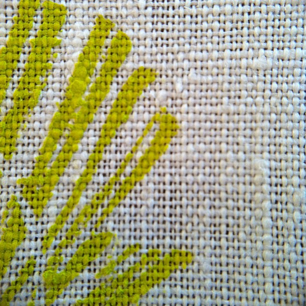
I've been a bit lacking in inspiration this week, so decided to keep busy with
printing up some fabric. I printed some of my Atomic Flower design in chartreuse
on white linen and a natural linen/cotton. The colour was a bit lost on the natural
so I overprinted in the same colour and was surprised at how the design
became more of a chrysanthemum kind of flower design.

So, yes... my creative space this week was looking at the relative charms of a
single verses a double print. I've decided I like them both.

The single print I'm going to make into cushions and bags... I think the cleaner
pattern will look better there. The double print I think might make a good top. Actually,
it looks amazing with another fabric I found at my local fabric store this week.

Hope you've had a great week. You can see more creative spaces here.
Both are gorgeous!! and quite different, if that makes sense, and doesn't sound dumb . xo
ReplyDeleteOne complements the other...have you considered making two cushions 'cos the variations always make the other more appealing. They would look great on sofas with bold colours wouldn't they?
ReplyDeleteI love the texture of the linen!!
ReplyDeleteAnd this colour is so fresh and gorgeous.XX
Fabulous Kylie. I love your willingness to have a crack. Look how great that worked out for you! xx
ReplyDeleteFab. I love the colours, the textures, the similarities and yet the complete and utter difference of both prints.
ReplyDeleteLove it all! The macramé fingers are itching to go! :)
ReplyDeletegreat colours and great using the double print option!!!
ReplyDeleteThey are fabulous. Always love where your risk taking spirit takes you.xx
ReplyDeleteIt's great to experiment and excellent when you get a gorgeous result... love the double print and it looks great with that other fabric :)
ReplyDeleteSimply beautiful! Your printing has really inspired me to try some of my own :).
ReplyDeleteStill loving that colour! Will they be going in the shop??
ReplyDeleteThanks Kellie :) Not sure yet about whether they'll get to the shop... I have a couple of friends with birthdays coming up ;) Kx
DeleteStill love the macro! It all looks fantastic!
ReplyDeleteooooooh, love! Love the natural texture of the fabric, the print, the contrast of neon with natural. Yum!
ReplyDeleteacidic tones are such faves for me, your chartreuse is perfection Kylie! i adore the juxtaposition of elements. it's retro, modern and futuristic all in one go! nice one lades. i'm a forever fan of yours :)
ReplyDeletei've been off the www grid for a bit now but am sure happy to be catching up here today :) between getting an end-of-summer cold and then vacating the premises to San Fran (the boyf & i finally had a real holiday-yah!), well things got a little hairy for any kind of blogging upkeep or visits. wishing you a fab weekend ahead, hope it's filled with creative jolts of fun! ♥